
Underground station Long Acre, Covent Garden
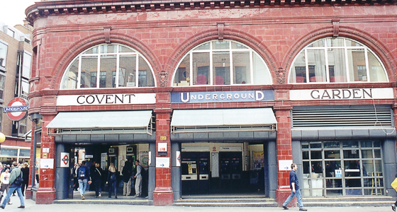
There are three periods of underground history to see here. The building dates from 1906 and was designed by Leslie Green, architect of the majority of the Yerkes ‘tube’ stations with their typical red—glazed façade. [note The first underground railway was London’s Metropolitan Railway from Baker Street to Farringdon Road which opened in 1863. This was a cut—and—cover construction – a huge trench was dug in the road, the railway was laid and a tunnel over it to support the road. The ‘tubes’ are strictly—speaking the deep—level tunnels excavated through solid earth behind some form of shield. The City & South London Railway was London’s first in 1890. The American financier Yerkes was behind the Underground Electric Railways Company of London. This included the Piccadily & Brompton, Baker Street & Waterloo, and Charing Cross, Euston & Hampstead Railways. All tubes and underground companies became part of London Transport in 1933.]
Covent Garden on the Piccadily & Brompton Railway opened in 1906. Like all the red—tiled stations it was built only two storeys high but designed to support more and so be developed later as land values rose.
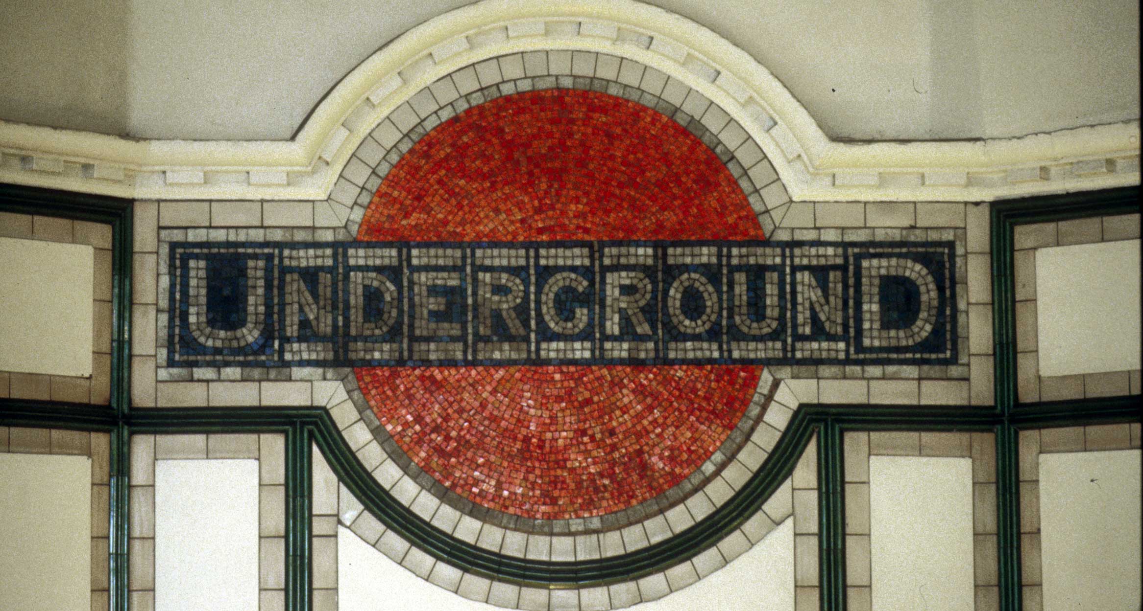
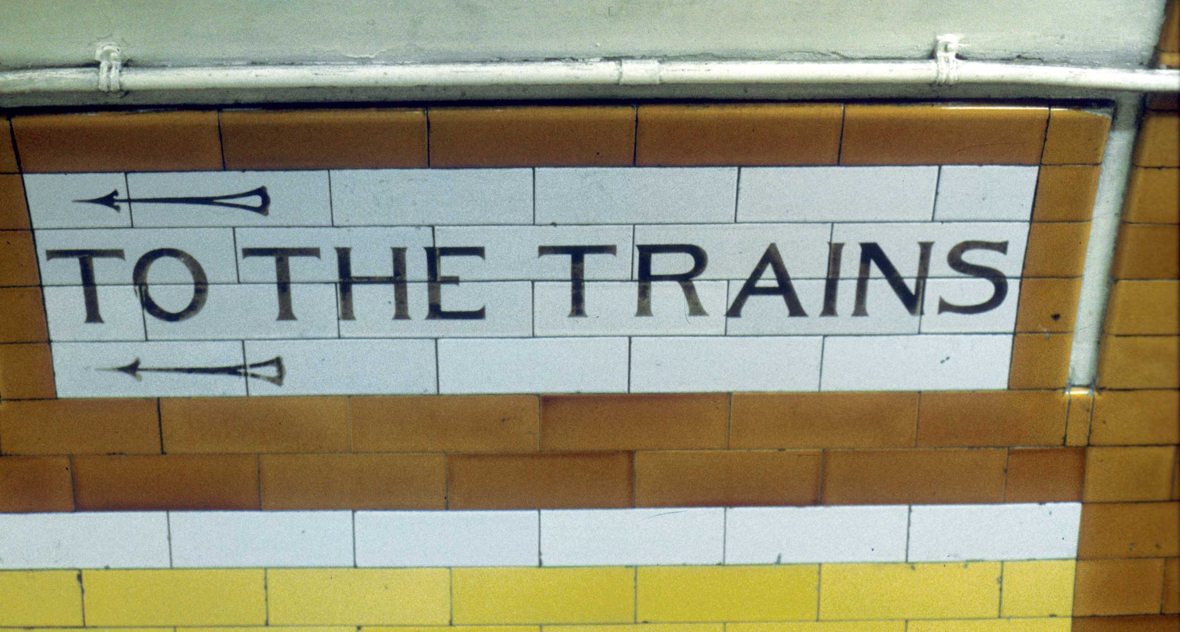
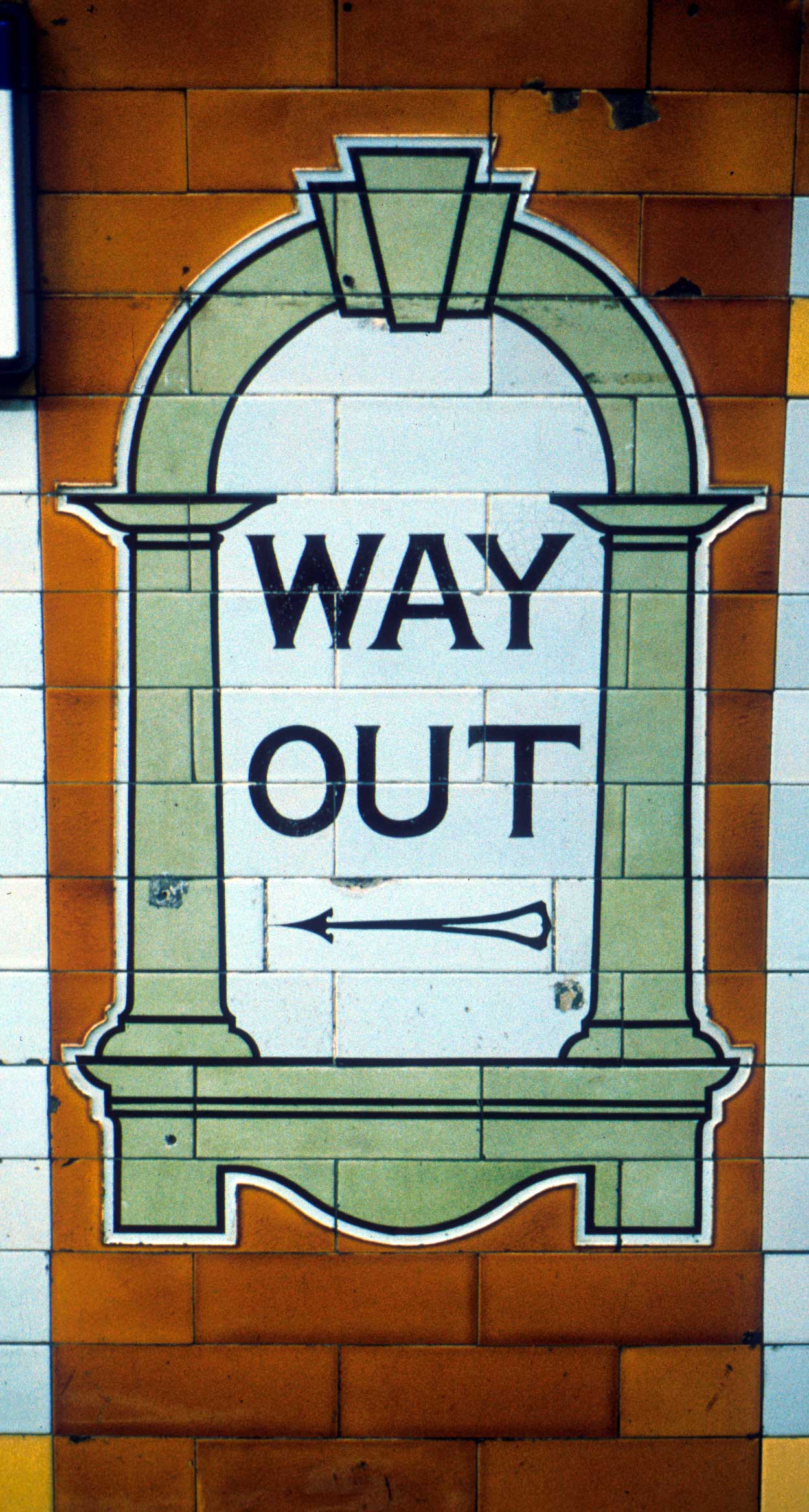
The earliest lettering here is the terracotta station name with ‘curvilinear’ lettering typical of its time. At platform level similar forms are made from ceramic tiles and set within coloured borders which differ from station to station. The word Underground appears in an anonymous sans serif with the characteristically large U and D which was first used around 1908.
The typeface most associated with London Transport actually pre—dates it. Commissioned by Frank Pick in 1916, it was drawn up by Edward Johnston. It was the first sans serif to depart from the prevailing grotesque pattern and has proportions based on Roman sources. When typesetting technologies and typographic fashions changed in the late 1970s there was talk of replacing the face but Colin Banks of Banks & Miles suggested that a re—drawn version would preserve ‘the hand writing of London’ as well as address the technological issues. New Johnston appeared in 1980, has an enlarged x—height and is used in slightly heavier weights than the original.
Station signage now uses the system designed by Henrion, Ludlow & Schmidt using the New Johnston typeface: apart from station names all signage is now upper & lower-case.
Details list – click to switch the current detail
Click to download the original image.
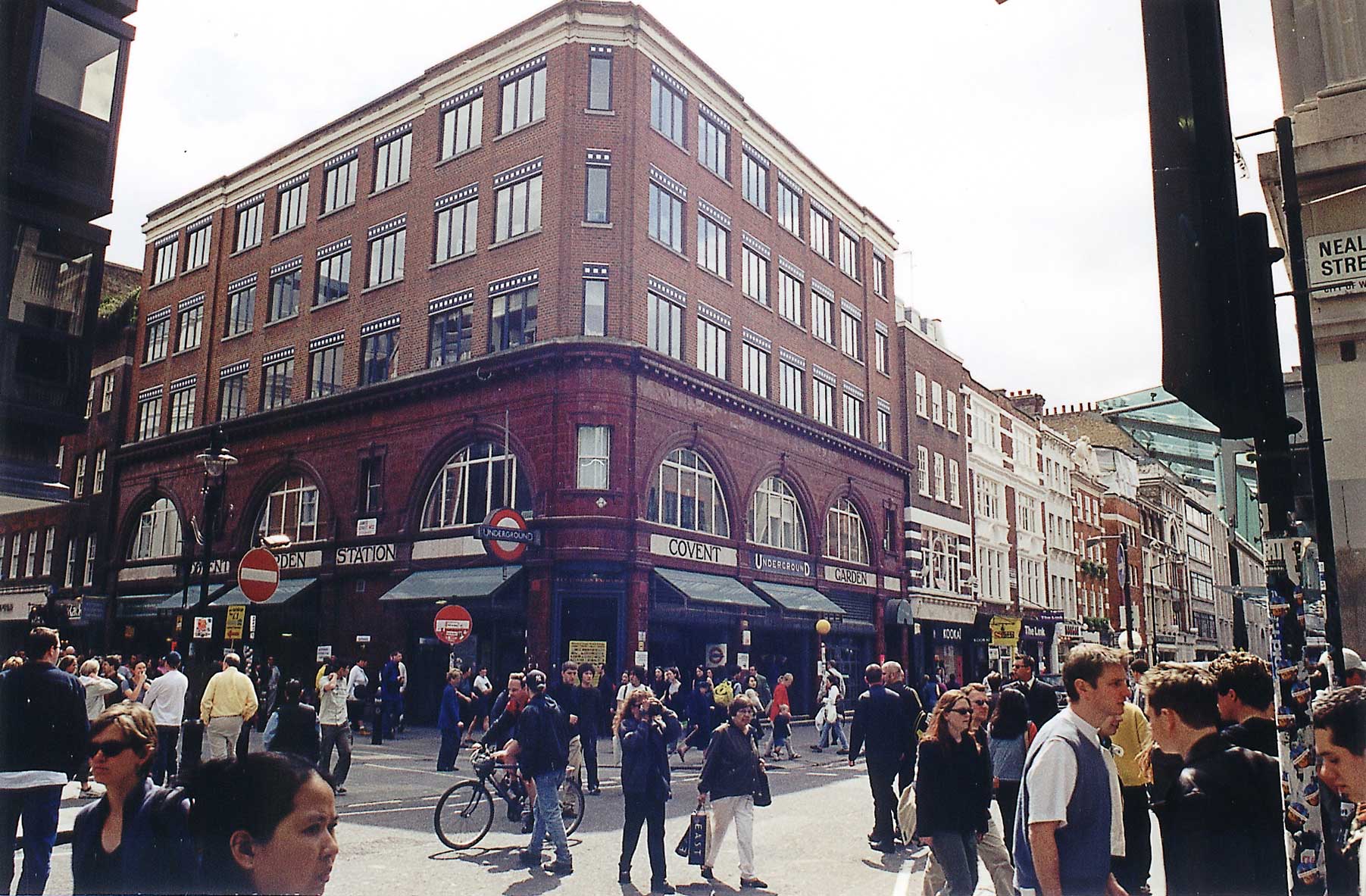
Covent Garden is a typical red-tiled station with upper floors of a later date.
Click to download the original image.
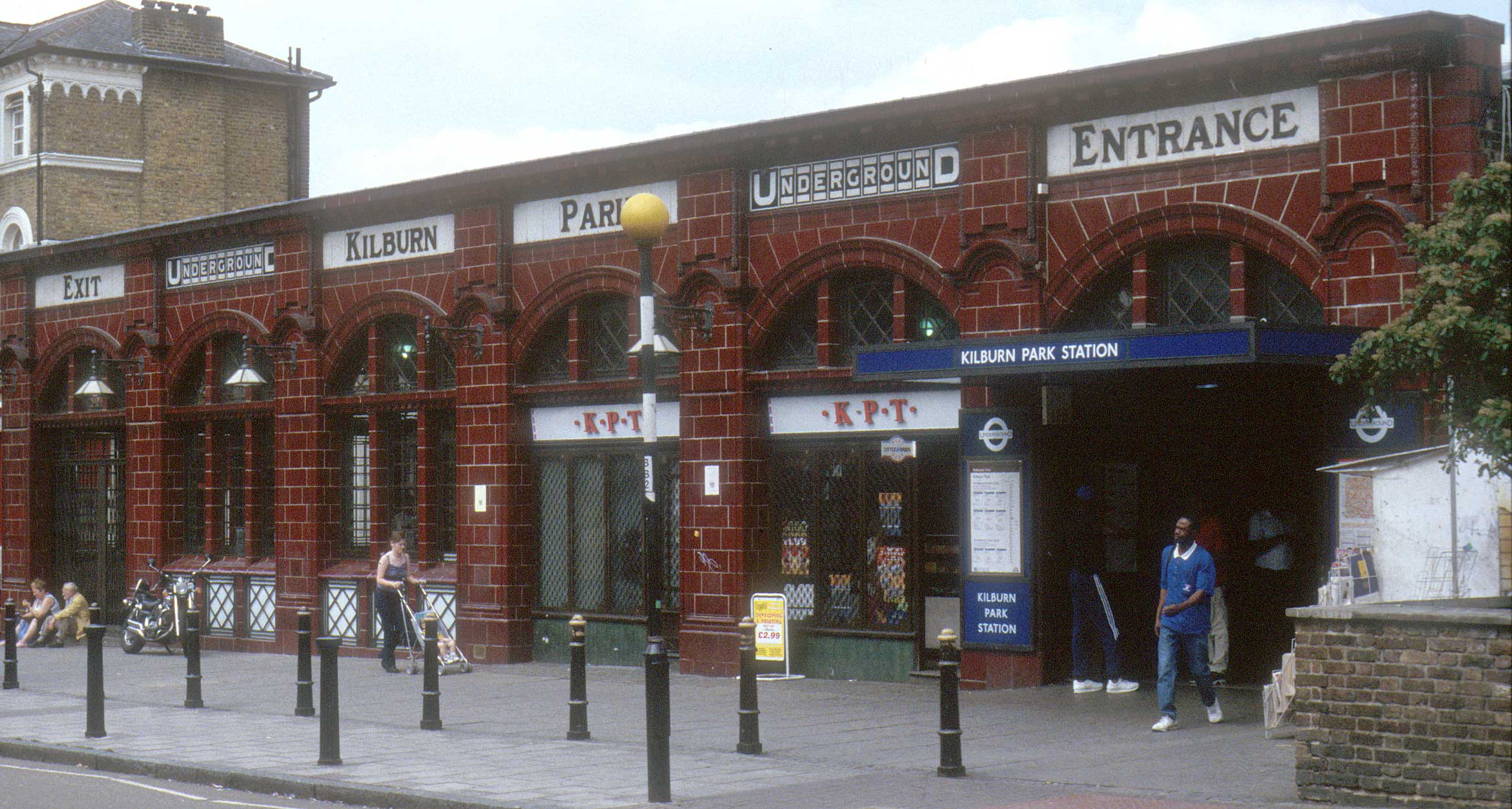
Stations away from the city centre, such as Kilburn Park, were never built over.
Click to download the original image.
Early forms of the roundel featured a solid circle. At Maida Vale (1915) this exists as a mosaic in the station foyer.
Click to download the original image.
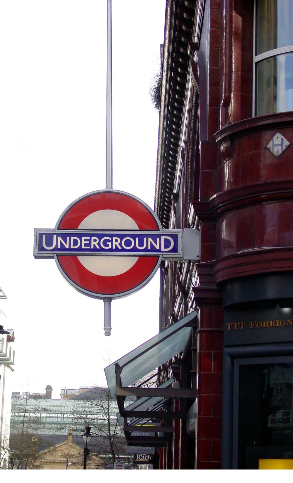
The 2001 ‘flagpole roundel’ at the corner of King Street in New Johnston. The weight and tight spacing does not help legibility, particularly when back-lit as here.
Click to download the original image.
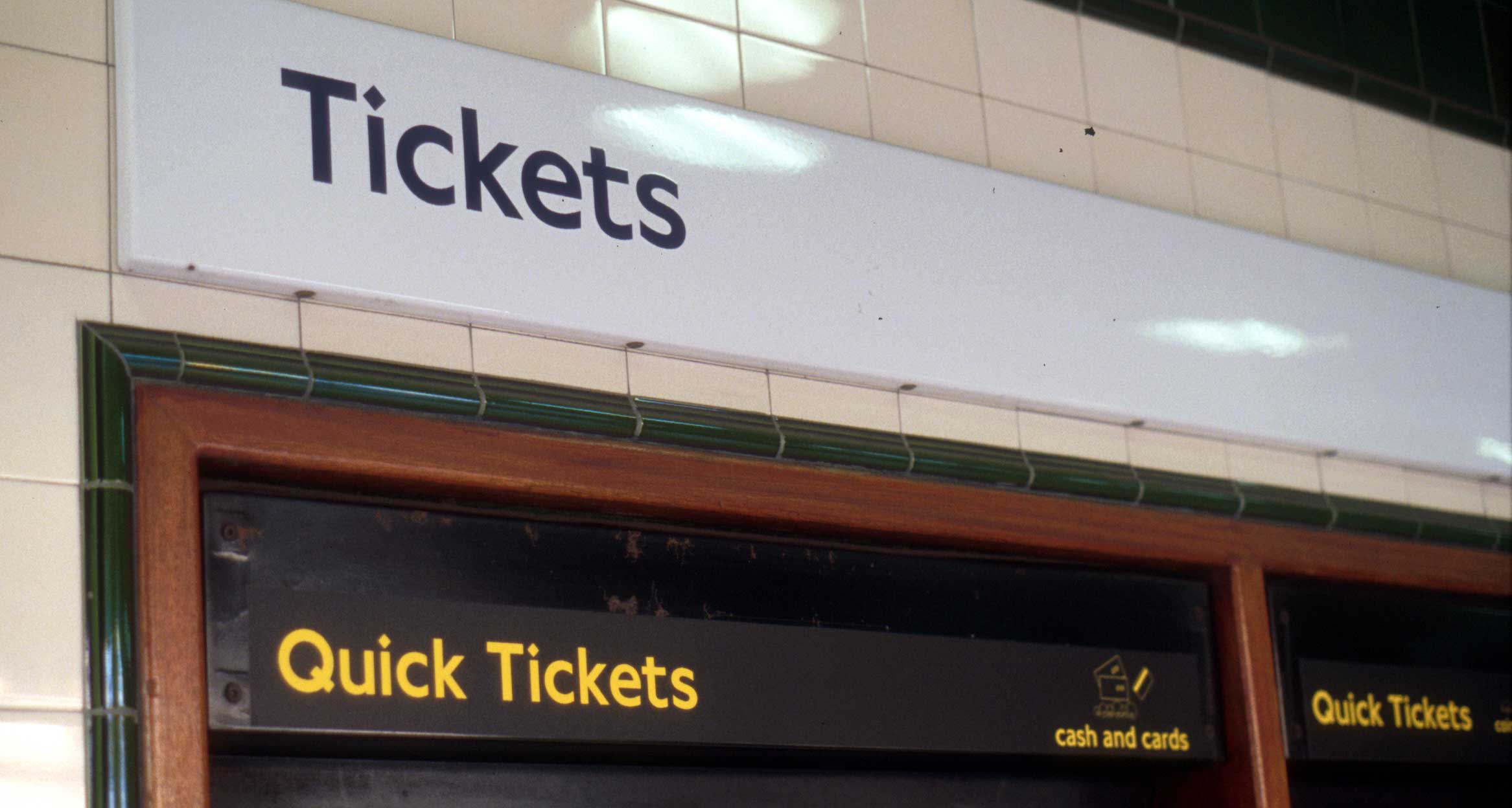
New Johnston type is now used in upper & lower-case for signs.