
St Martin’s Schools St Martin’s Mews
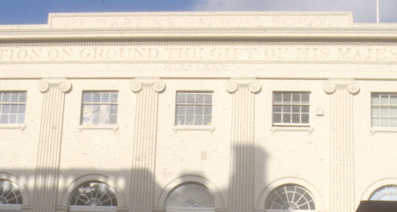
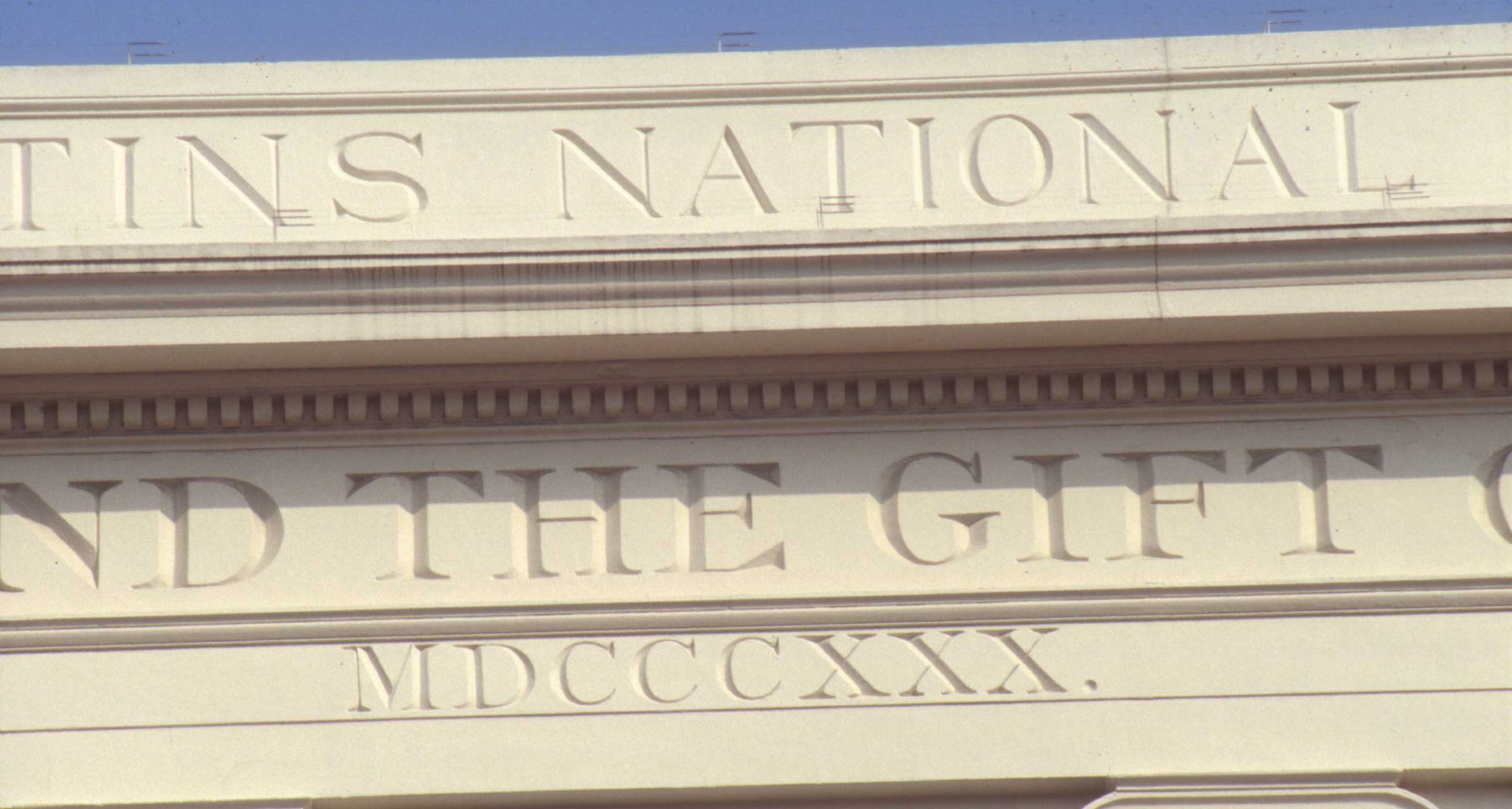
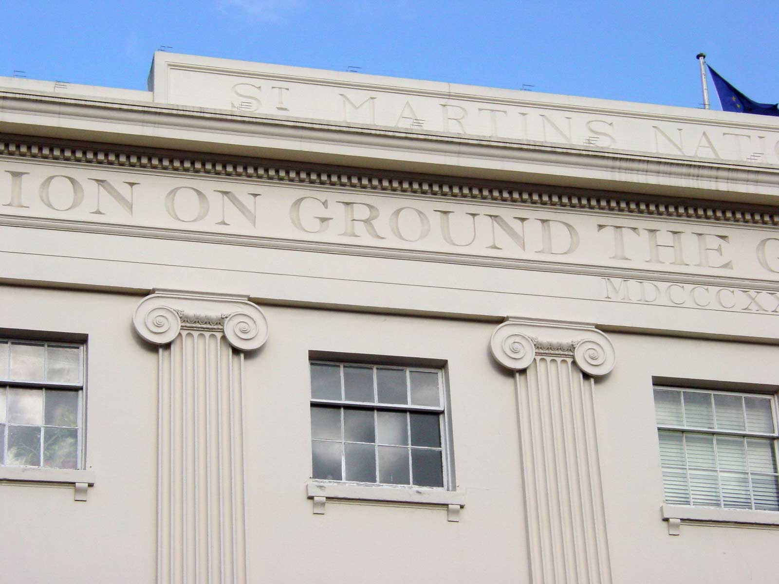
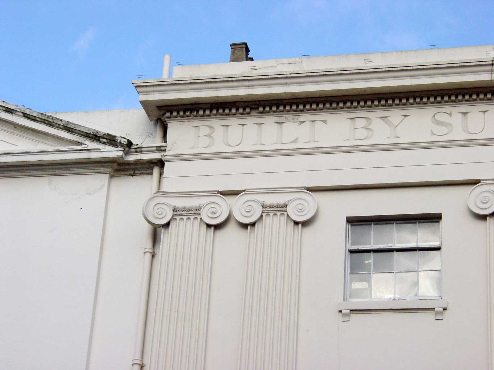
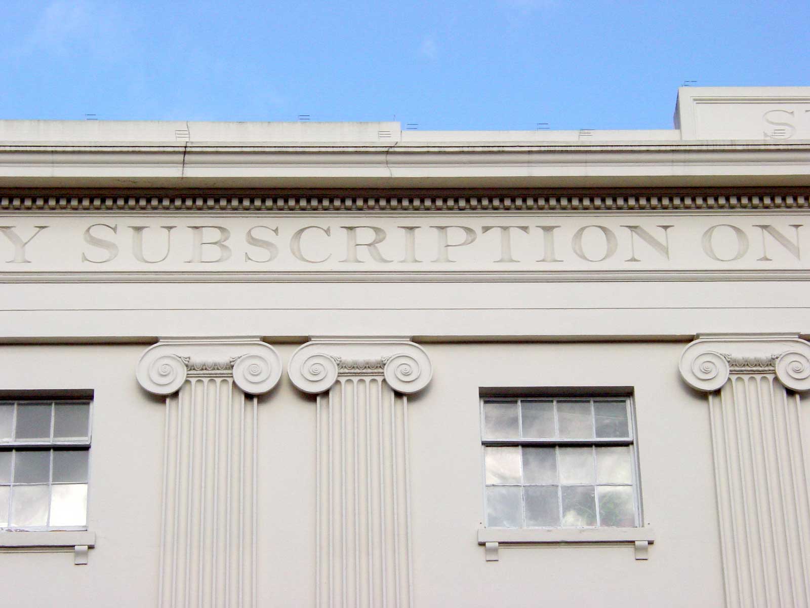
This is a good teaching aid: compare the top and middle lines, even if you can’t explain precisely what good lettering is, the top and middle lines do it for you. The top line is well positioned but has weak letters, the date has good letters but is incredibly cramped. The middle line is near perfect, what Bartram calls the ‘English letter’, robust, even proportions for all the letters (unlike the roman model), and a strong contrast between thick and thin strokes. Note too that the success of public lettering depends not just on the letterforms but on how they work within their place on the building and with the architecture as a whole.
Details list – click to switch the current detail
Click to download the original image.
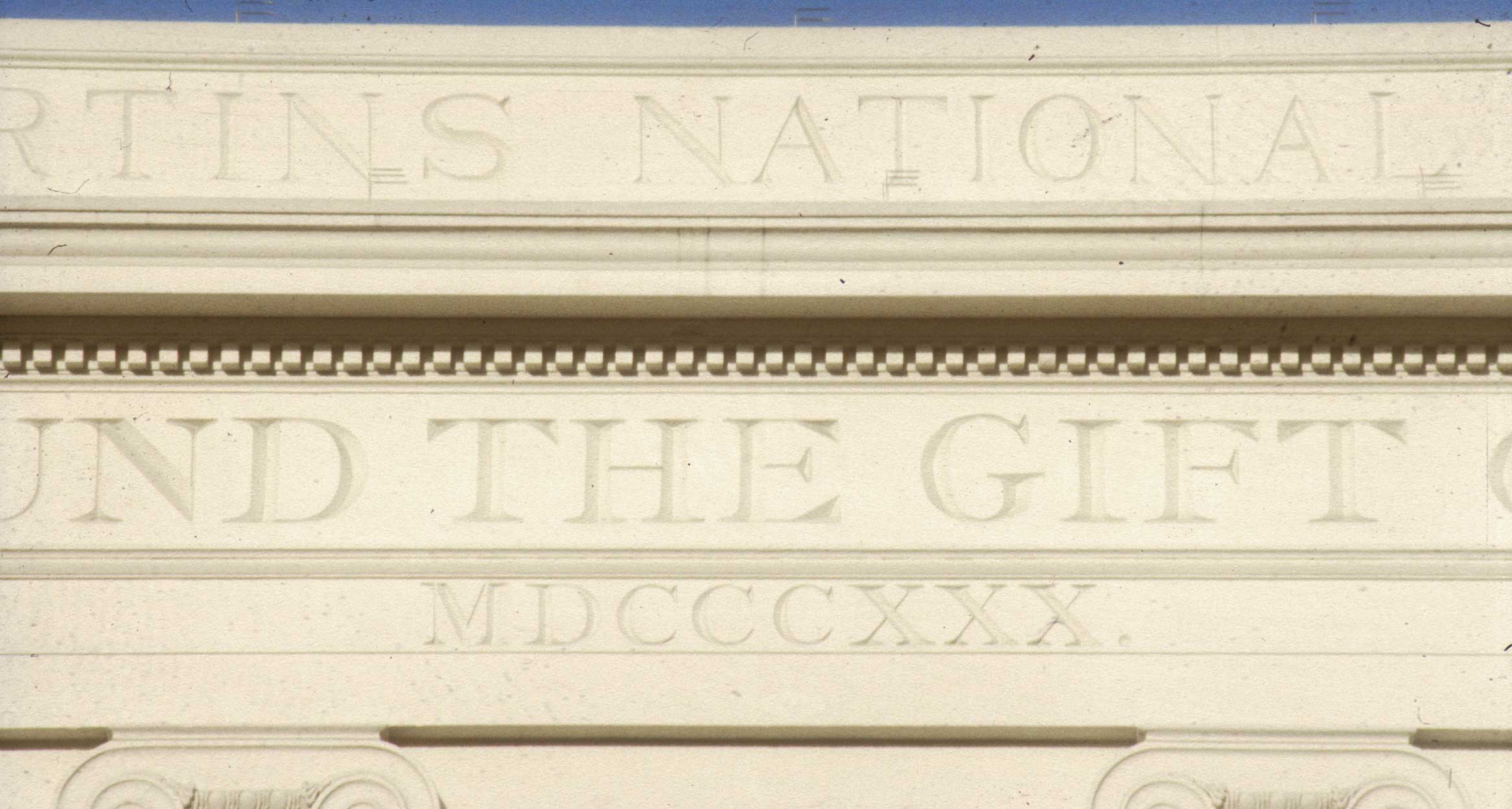
The middle line is a near perfect match of letterform, material and use of space.
Click to download the original image.
The middle line is a near perfect match of letterform, material and use of space.
Click to download the original image.
The middle line is a near perfect match of letterform, material and use of space.
Click to download the original image.

The middle line is a near perfect match of letterform, material and use of space.
Click to download the original image.
A near perfect match of letterform, material and use of space.
Click to download the original image.
A near perfect match of letterform, material and use of space.
Close ups 3
Click to download the original image.

A near perfect match of letterform, material and use of space.