
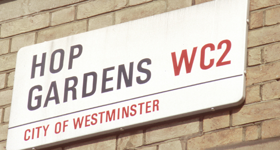
Street names Hop Gardens and elsewhere
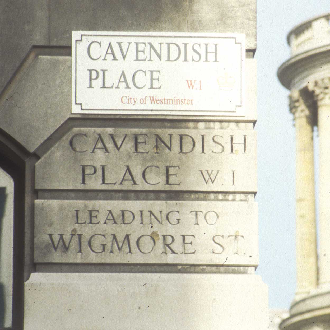
The Victorians and Edwardians were very straightforward about street names choosing robust letterforms and long-lasting materials. Among the best post-war solutions are the City of Westminster signs designed by Chris Tinings at the DRU c.1968. They use two colours and sizes of Univers Bold Condensed to create a clear hierarchy of information. Produced from vitreous stove enamelled steel, their 25mm return gives them considerable presence whatever the background material.
Any reservations I have about the scheme concern not the design but the scale and necessity of its application: did every street name in Westminster really need replacing at this time? Was it really necessary to define the new borough’s territory quite so pedantically, it’s rather like a dog marking its territory. Several serviceable older versions exist along Floral Street [pic] nearby.
Details list – click to switch the current detail
Click to download the original image.
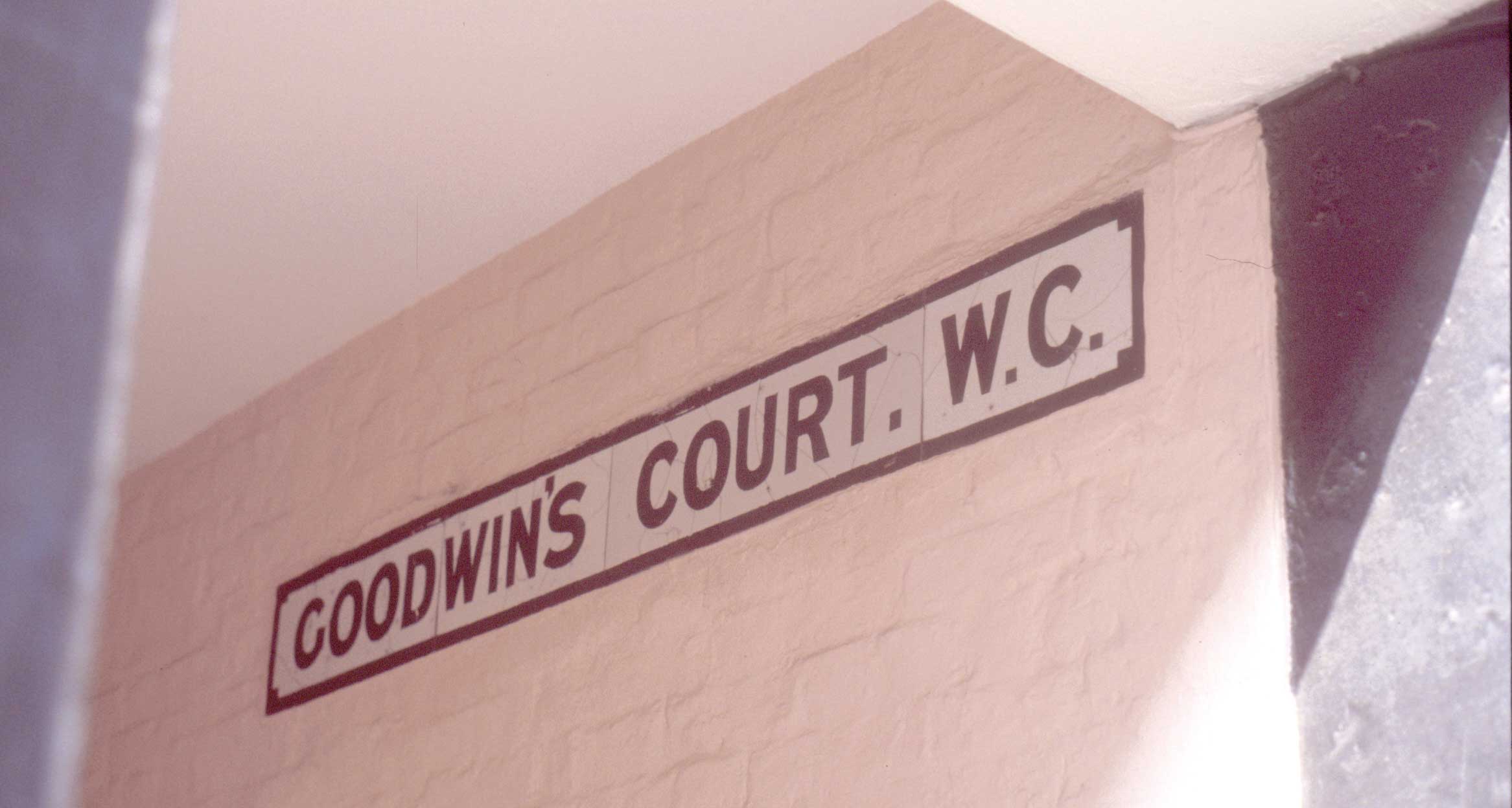
Ceramic sign surviving nearby on London’s last gas-lit street.
Click to download the original image.
Despite their clarity, the standard pattern of Westminster street names was not deemed ‘sensitive’ enough in certain areas. In 1995 these appeared. Note the size difference: these could not be read from across the street and were removed soon after.
Click to download the original image.
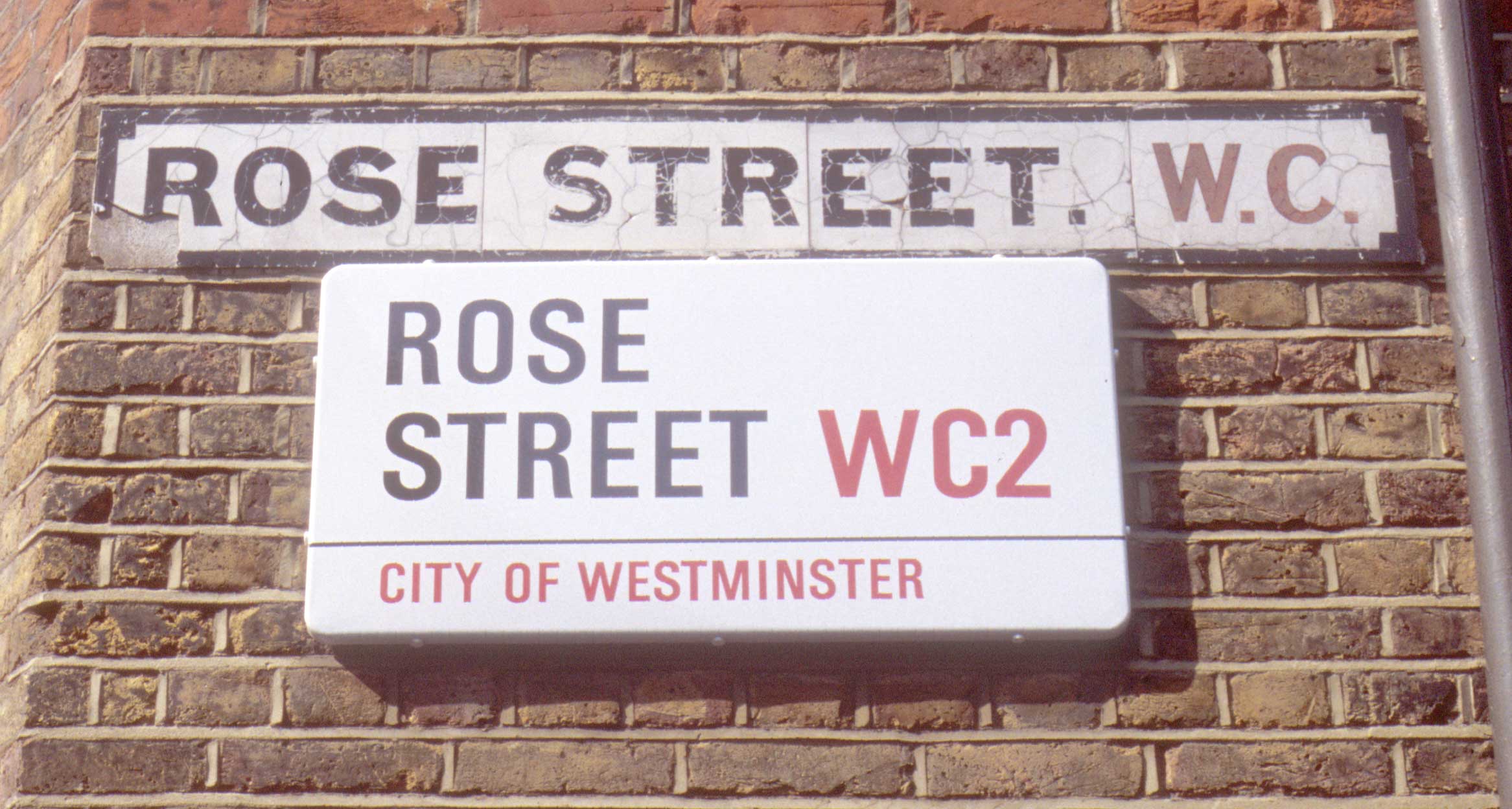
The replacement for the 1995 blue names is at least legible, but why is one needed here?
Also nearby
Click to download the original image.
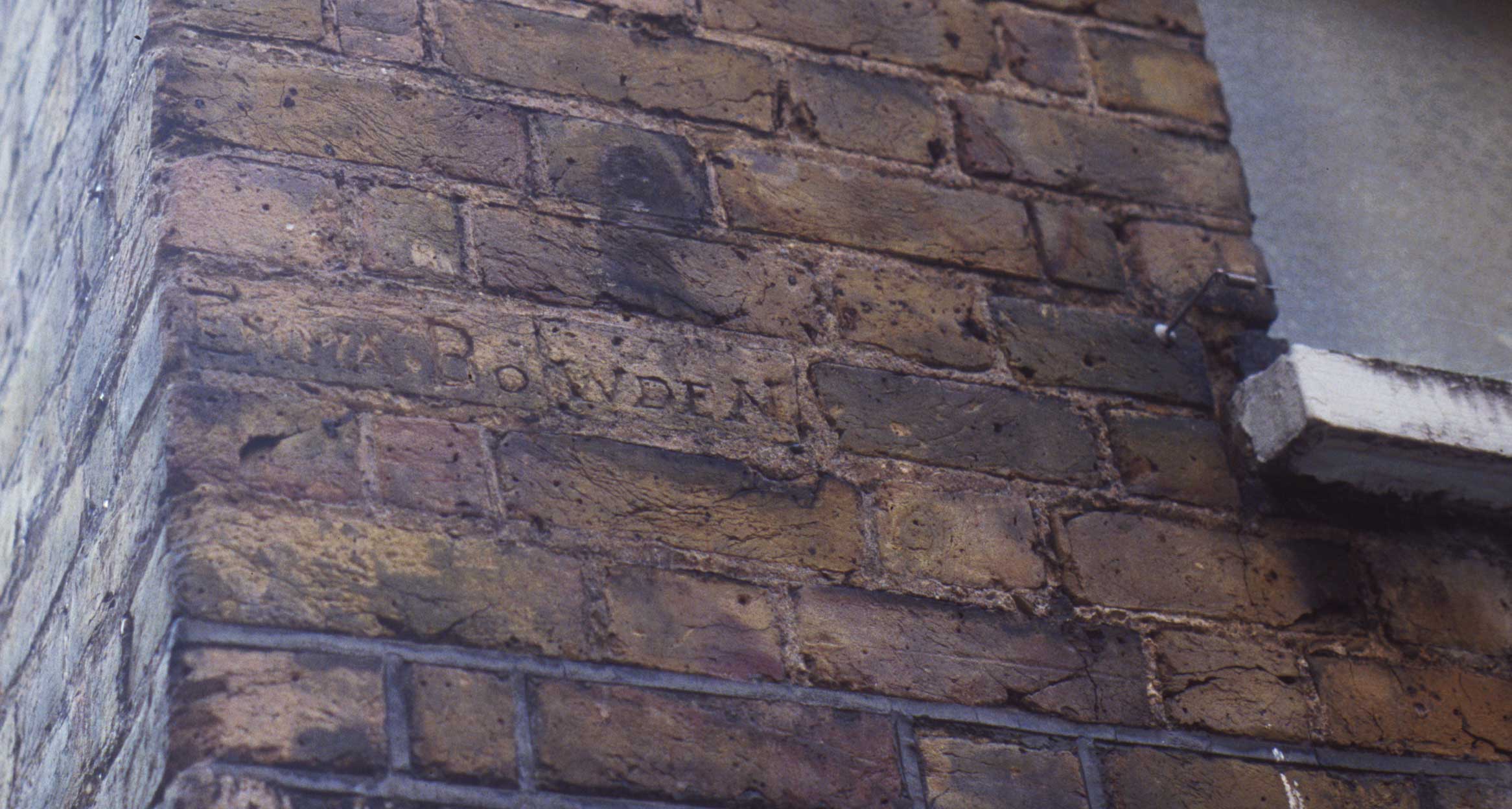
Above head height, opposite the Lamb & Flag on Rose Street, can be seen a name denoting a prostitute’s territory.